You have a beautiful WordPress website, you picked a beautiful theme, but you found out that when you scroll, the menu stays up at the top of the page (so it disappears from view)? On longer pages this can be quite frustrating for visitors. The solution is to pin the top bar where the menu sits. You don’t need to look for a new theme – a few lines of code will do.
Finding the right tag
First, you need to find out which tag in the page’s HTML code we’ll add a style to that makes the menu scroll along with us. I’m writing this for Mozilla Firefox, or Google Chrome, where the procedure is almost the same. I right-click the section that contains our menu and choose Inspect Element (in Chrome, Inspect).
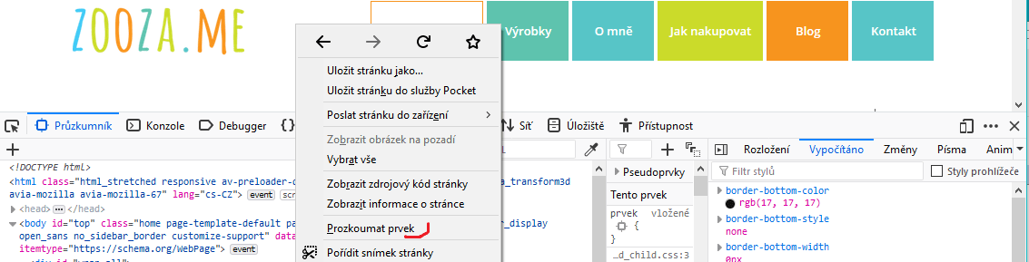
The lower half of the screen will show the page’s source code. As you move the mouse over it, the sections of the page that the code is responsible for get highlighted. To put it simply, we need our menu to get highlighted.
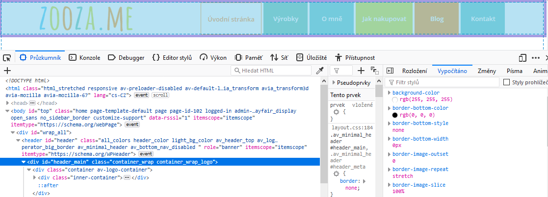
In this case the menu is rendered in a div tag that has id=”header_main”. We can try the code out right away in the Style Editor that Firefox offers. We switch to it and type the following code (anywhere); each theme will probably need a slightly different one, but the principle is the same)
#header_main{

position: fixed;

background-color: white;

width: 100%;

padding: 5px;

}
The important part is the position: fixed declaration, which pins the menu so that it “travels” with us across the screen. You may (or may not) need the other lines depending on your theme. background-color:white takes care of giving the menu a white background. If I didn’t add it, there would be a transparent area between the logo and the buttons. width:100% stretches the menu across the full width of the screen. padding adds a small inner spacing so the link buttons have a bit of white space beneath them.
Saving the code, responsiveness
If the code works, we can save it permanently. Every theme offers some way to customize CSS (Appearance – Additional CSS), or we can write the code directly into a CSS file and upload it to the server via an FTP client. The menu should now move along the screen. On desktop that’s probably fine, but on mobile this isn’t usual (we want as much of the screen as possible for content). So we can target our style only at larger screens. We’ll adjust it, for example, like this:
@media only screen and (min-width: 768px) {

#header_main{

position: fixed;

background-color: white;

width: 100%;

padding: 5px;

}

}
So the style applies to screens 768px and wider. For smaller ones the original rules apply.
If you need help building or finishing your website, not only on WordPress, you can contact me.